Widgets Module
Widgets module with simplified API and optimized clean visualizations..
Introduction
Widgets are designed to generate smart, simple data visualizations that enhance readability and reduce visual clutter. The simplified flat API promotes compatibility with front-end frameworks and reduces the learning curve. JSCharting widgets conform to your website's CSS styles and can be styled using specific CSS classes or by editing the example CSS file.
Features
- Circular widget - A progress style circular KPI widget.
- Linear widget - A progress style linear KPI widget.
- Bar-Column widget - To compare multiple values.
- Simplified API
- Intelligently simplified visuals
- CSS support for label styling
- Dark mode compatible
Install
Using CDN
Visit the CDN index for a list of available releases. Include JSCharting and the widget library in your HTML page.
<script src="https://code.jscharting.com/latest/jscharting.js"></script>
<script
src="https://code.jscharting.com/latest/jscharting-widgets.js"></script>
Using with downloadable bundle
<script src="jsc/jscharting.js"></script> <script
src="jsc/jscharting-widgets.js"></script>
Download
The latest release is included with the JSCharting bundle and can be downloaded here.
First Widget Chart
First add an HTML div element for the widget to render in.
<div id="widgetDiv" style="width: 100%; height: 400px;"></div>
Instantiate the widget visual.
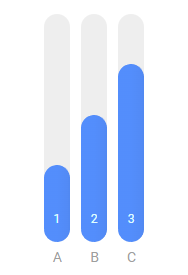
const widget1 = new JSCWidgets.BarColumn("widgetDiv", {
  value: [1, 2, 3],
  label: ["A", "B", "C"]
});
Basic functionality
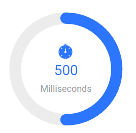
All widgets use the value and label option to define data for a visual as seen in the example above. A 3rd option used with Circular and Linear types is the icon option which assigns an icon to each value. These options can be set with arrays of values or just a single value. Here's an example with single values and the Circular type.
const widget1 = new JSCWidgets.Circular("widgetDiv", {
  icon: "linear/basic/chronometer",
  value: 500,
  label: "Milliseconds",
  max: 1000
});
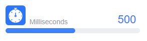
The same example using the Linear type.
const widget1 = new JSCWidgets.Linear("widgetDiv", {
  icon: "linear/basic/chronometer",
  value: 500,
  label: "Milliseconds",
  max: 1000
});
Visit the icon browser to choose from a large set of icons built into the package. Simply click the icon to copy to clipboard and paste it into your code to use with the icon option.
You can also specify raster and svg image file paths, or a custom SVG vector path to use with the icon option.
The BarColumn type is useful for comparing multiple values such as values for days of the week or months. The Circular and Linear widgets are useful for comparing a value to the specified minimum and maximum, similar to a progress bar. If multiple values are used and no maximum is specified, a maximum value will automatically be set to include all values.
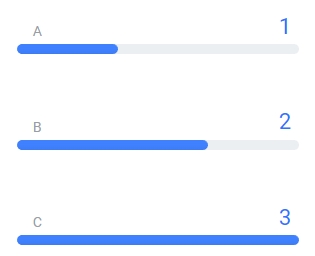
Multiple values without a max setting.
const widget1 = new JSCWidgets.Linear("widgetDiv", {
  value: [1, 2, 3],
  label: ["A", "B", "C"]
});
However, with single values, the chart will automatically choose a max value near the actual value and lack meaning. In this case, it is recommended to supply a max value that indicates how close to the goal value the bar is.
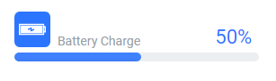
An example with max values on a Linear widget.
const widget1 = new JSCWidgets.Linear("widgetDiv", {
  value: 0.5,
  icon: "linear/basic/battery-charge",
  label: "Battery Charge",
  min: 0,
  max: 1,
  valueFormat: "p"
});
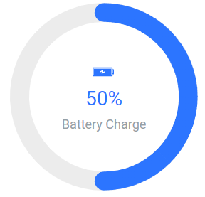
And with the Circular widget.
const widget1 = new JSCWidgets.Circular("widgetDiv", {
  value: 0.5,
  icon: "linear/basic/battery-charge",
  label: "Battery Charge",
  min: 0,
  max: 1,
  valueFormat: "p"
});
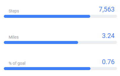
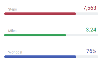
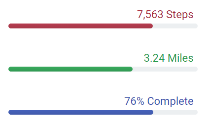
A different min and max setting can be used for each value. For example:
const widget1 = new JSCWidgets.Linear("widgetDiv", {
  value: [7563, 3.24, 0.76],
  label: ["Steps", "Miles", "% of goal"],
  max: [10000, 5, 1]
});
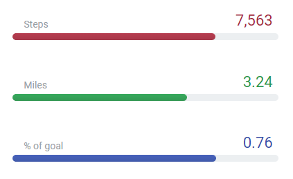
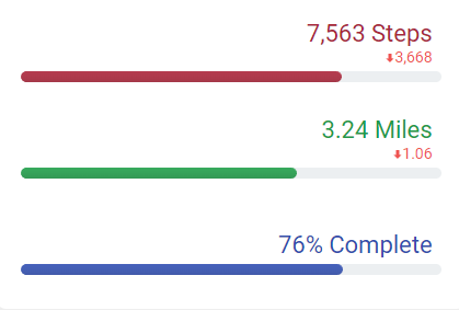
Use the color option to set the same color for all values or an array of colors to set them individually.
const widget1 = new JSCWidgets.Linear("widgetDiv", {
  color: ["#a8273a", "#229a48", "#324fad"],
  value: [7563, 3.24, 0.76],
  label: ["Steps", "Miles", "% of goal"],
  max: [10000, 5, 1]
});
Label Shortcuts
You can use shortcut values with the label option including weekdays, months, and quarters. Here's an example:
const widget1 = new JSCWidgets.BarColumn("widgetDiv", {
  value: [1, 2, 3],
  label: "weekdays"
});
Creates labels Mon, Tue, and Wed.
Use the labelStart option to control the first label with a number offset or specific date. For example:
const widget1 = new JSCWidgets.BarColumn("widgetDiv", {
  value: [1, 2, 3],
  label: "weekdays",
  labelStart: 1
});
Offsets the start by 1, generating the labels: Tue, Wed, and Thu.
const widget1 = new JSCWidgets.BarColumn("widgetDiv", {
  value: [1, 2, 3],
  label: "weekdays",
  labelStart: "1/5/2023"
});
Starts labeling on this day with Thu, Fri, and Sat.
NOTE: Weekdays and month names can be written out in any language by setting the cultureName property.
Another way you can use these options is to automatically generate dates that increment by a day or month and format them as needed. Use this to avoid having to pass a specific date for every data point when you know values increment sequentially. For this to work you must set weekdays or months label setting and a labelStart date value. The example above creates a day label for each value starting on 1/5/2023. Adding a date format string to this example allows formatting incrementing dates without passing a list of specific dates.
const widget1 = new JSCWidgets.BarColumn("widgetDiv", {
  value: [1, 2, 3, 4, 5],
  label: "weekdays",
  labelStart: "1/5/2023",
  timeLabelFormat: "d"
});
Generates labels: 1/5/2023, 1/6/2023, 1/7/2023, 1/8/2023, and 1/9/2023. Whereas using months in this case:
const widget1 = new JSCWidgets.BarColumn("widgetDiv", {
  value: [1, 2, 3, 4, 5],
  label: "months",
  labelStart: "1/5/2023",
  timeLabelFormat: "d"
});
Generates labels: 1/5/2023, 2/5/2023, 3/5/2023, 4/5/2023, and 5/5/2023.
Widget Visual Bar Styling
Each of the 3 widget types visualize data using bars or columns. The styling of these bars can be controlled by setting these common widget options.
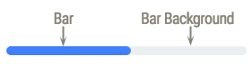
barWidth- Pixel width of bar or column data point. Automatic by default.barBackgroundWidth- Pixel width of the background path the bar fills as the value approaches the maximum. By default, the width matches the bar width.barBackgroundColor- Color of the background path the bar fill as the values approaches the maximum.barRounded- Setfalseto disable rounded bars.
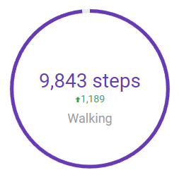
An example with Circular widget type.
const widget1 = new JSCWidgets.Circular("widgetDiv", {
  label: "Walking",
  value: 9843,
  prevValue: 8654,
  valueText: "%value steps",
  max: 10000,
  barWidth: 5,
  barRounded: false,
  color: "#673AB7"
});
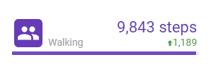
The same example but with Linear widget type.
const widget1 = new JSCWidgets.Linear("widgetDiv", {
  label: "Walking",
  value: 9843,
  prevValue: 8654,
  valueText: "%value steps",
  max: 10000,
  barWidth: 5,
  barRounded: false,
  color: "#673AB7"
});
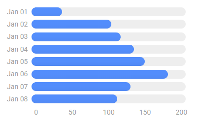
BarColumn Widget
The unique options available with the BarColumn widget are yAxis and horizontal.
Set yAxis to true to draw a Y axis in this widget. This will remove the labels from each column and enable tooltips showing values when hovering columns with the mouse and tap on mobile. When not set, each column shows a value and the Y axis is hidden.
Use the horizontal option to draw the columns horizontally as bars.
This example demonstrates both options:
const widget1 = new JSCWidgets.BarColumn("widgetDiv", {
  value: [29.9, 97.5, 110.4, 129.2, 144, 176, 124, 106],
  label: [
    "01/01/2022",
    "01/02/2022",
    "01/03/2022",
    "01/04/2022",
    "01/05/2022",
    "01/06/2022",
    "01/07/2022",
    "01/08/2022"
  ],
  timeLabelFormat: "MMM dd",
  horizontal: true,
  yAxis: true
});
Linear and Circular Widgets
The Linear and Circular widgets share a number of features described below.
You can specify prevValue to show the value change from the current value. The difference is shown below the value. Specifying undefined for any of the items in the array will skip the feature for that item. For example:
const widget1 = new JSCWidgets.Linear("widgetDiv", {
  color: ["#a8273a", "#229a48", "#324fad"],
  value: [7563, 3.24, 0.76],
  prevValue: [11231, 4.3, undefined],
  label: ["Steps", "Miles", "% of goal"],
  valueFormat: ["n", "n2", "p"],
  max: [10000, 5, 1]
});
The value, label, and icon labels can be positioned or aligned to any side around the visual. Three options are available to control the positioning.
valuePosition- Positions the value label.labelPosition- Positions the label.iconPosition- Positions the icon.
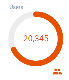
You can set both vertical and horizontal positions with these options. Supported positions include “top”, “bottom”, “left”, “right” and all combinations such as “top left”, “bottom right” etc. The Circular widget also support center which places the label inside the circle.
const widget1 = new JSCWidgets.Circular("widgetDiv", {
  label: "Users",
  value: 20345,
  icon: "material/social/people",
  max: 30000,
  color: "#E65100",
  labelPosition: "top left",
  iconPosition: "bottom right"
});
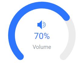
The Circular widget also supports a sweep option. This option sets the angular sweep, in degrees, the bar moves along. By default, the value is 360 meaning the bar completes a full circle to reach the max value. Setting a different sweep also changes the start and end position of the bar. This example sets a sweep of 270 degrees:
const widget1 = new JSCWidgets.Circular("widgetDiv", {
  icon: "linear/music/volume-up",
  value: 0.7,
  label: "Volume",
  max: 1,
  valueFormat: "p",
  sweep: 270
});
Update the Widget
You can modify widget options using the widget options() method.
widget1.options({ value: [4, 3, 2] });
This automatically attempts to animate the value change. You can also modify the update behavior with animation options, including a callback when the animation completes.
widget1.options(
  { value: [4, 3, 2] },
  {
    animation: { duration: 1000, easing: "easeInBack" },
    then: function() {
      console.log("Widget update animation complete");
    }
  }
);
Get the value of any option by passing a string option name to the options() method with:
widget1.options("values"); // -> [4,3,2]
Formatting & Internationalization
To control the numeric and time value formats, use the cultureName, valueFormat and timeLabelFormat widget options.
const widget1 = new JSCWidgets.BarColumn("widgetDiv", {
  cultureName: "en-US",
  valueFormat: "n1",
  value: [1, 2, 3],
  label: ["A", "B", "C"]
});
Formats the numbers as 1.0, 2.0, and 3.0
You can format each value independently by using an array with the valueFormat option.
const widget1 = new JSCWidgets.Linear("widgetDiv", {
  color: ["#a8273a", "#229a48", "#324fad"],
  value: [7563, 3.24, 0.76],
  label: ["Steps", "Miles", "% of goal"],
  valueFormat: ["n", "n2", "p"],
  max: [10000, 5, 1]
});
Additionally, use the valueText option to fully control the value text string. Include the %value string token in place of the actual value in this template string.
const widget1 = new JSCWidgets.Linear("widgetDiv", {
  color: ["#a8273a", "#229a48", "#324fad"],
  value: [7563, 3.24, 0.76],
  valueText: ["%value Steps", "%value Miles", "%value Complete"],
  valueFormat: ["n", "n2", "p"],
  max: [10000, 5, 1]
});
The available text templates you can modify include:
valueText- default value:%valueiconText- default value:%iconlabelText- default value:%name
All the tokens like %value work in all labels and can be repurposed as needed. You can also use the %min and %max tokens which will be replaced by the actual min and max values you specify. They will not work if min and max are not provided. For example, using this strings creates a label like 50 50%
'%value {%value/%max*100}%' //-> '50 50%'
Visit the Label Expressions Tutorial for more information and examples.
Use string dates with the label option and timeLabelFormat to modify their formatting or display them with different culture formats automatically. Setting the timeLabelFormat option indicates label values should be treated as dates.
const widget1 = new JSCWidgets.BarColumn("widgetDiv", {
  cultureName: "en-US",
  valueFormat: "n1",
  value: [1, 2, 3],
  label: ["1/2/20", "1/3/20", "1/4/20"],
  timeLabelFormat: "M/d"
});
This labels the 3 bars as 1/2, 1/3, and 1/4.
To show labels with culture specific formatting:
const widget1 = new JSCWidgets.BarColumn("widgetDiv", {
  cultureName: "pl-PL",
  valueFormat: "n1",
  value: [1, 2, 3],
  label: ["1/2/20", "1/3/20", "1/4/20"],
  timeLabelFormat: "d"
});
Results in 2.01.2020, 3.01.2020, and 4.01.2020.
Possible format options are described in these articles. Standard formatting options Standard Number e.g. 'c' for currency, n2 for number with two decimal places. Standard Date formats.
For more control you can create a custom date and number format as described in Custom Date and Custom Number articles.
CSS styling
You can use CSS to control text styles in widgets. Use combinations of the following classes to style specific widget text. An example CSS file is included in the widgets package and example project.
The main class jsc-widget
For specific types
CSS classes for specific widget types.
linearcircularbar-column
Classes for specific widget labels
titlevalueiconlabeltargetaxis-ticks- used with BarColumn type whenoptions.yAxis=true;Otherwise the X axis labels uselabelclass.tooltip- used with BarColumn whenoptions.yAxis=true;
Supported CSS variables
font-family- Font family.font-weight- Font weightfont-size- Requires a widget.refresh() call if relative sizes are used and related items change size.color- Text colorfont-style- Text style.text-decoration- Only the basic decoration type is supported. Different colors, thickness or style are not supported.cursor- Mouse cursor on hover.text-align- Supported for widget title only.
Example:
.jsc-widget { color: #95a0a6 }
.jsc-widget .icon { font-size: 40px; }
.jsc-widget .circular .icon	{ font-size: 50px; }
Widgets check CSS settings after rendering the chart to make sure they have not changed during rendering. If changed, the widget will reload automatically with updated styling settings. If the widget CSS styles are modified during runtime, you must call widget.refresh() to apply updated styles. You can use a callback in the widget constructor that returns false to prevents the second CSS style check.
Some text, such as value on linear and circular widgets, takes on the color of the data point. If the CSS value class has a color variable that is different from the inherited color, then it will override it. Otherwise, the color is ignored and the point color is used.