Line Spline Step
Describes line series type usage and features.
The line series type is made up of connected points showing change in value over a continuous scale such as time. It is an effective way to show trends and compare trends of multiple line series.
The line chart is useful because it is universally understood. It is often used when conveying the trend or change in y value over the x scale with reduced emphasis on the individual data points.
Simple Example
See the Pen Docs - Line Type by Arthur Puszynski (@jsblog) on CodePen.
Line Types
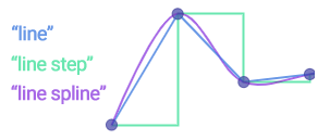
Three types of line shapes can be created. Standard line, curved lines (spline), and stepped lines. The series type settings for the different line types are:

Curved lines are used when the actual data doesn't change direction abruptly (such as outdoor temperature) or to smooth the visuals for aesthetic purposes. Curved line tension can be adjusted through the series.line.tension property.
Step lines are useful when the underlying data points represent x value spans rather than an instance on the X axis. For example, say data points represent days and date x values refer to midnight. Having the line remain flat for the entire day until midnight the next day is more correct in some scenarios than showing the y value change throughout the day to the next day’s value.
Line Styling
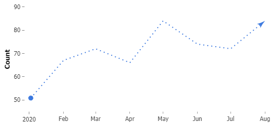
The series line visual settings can be modified through the series.line property. Some options include modifying the line width, dash style, and line caps.
The following code snippet styles the line with a dash style and line caps at each end.
chart.series(0).options({
  line: {
    dashStyle: "dot",
    caps: {
      size: "500%",
      end_type: "arrow",
      start_type: "circle"
    }
  },
  defaultPoint_marker_visible: false
});

Empty Points
A line series can sometimes have y values that are not specified. Points where the y value is set to null are considered empty. The series.emptyPointMode property accepts a few options for how this scenario should be visualized.
- default
When not specified, the chart shows an incontinuity (gap) in the line. - ignore
Empty points are ignored and the line continues to the next available point. - treatAsZero
Point will behave as if its y value is 0.
Examples
The goal of any chart is to translate quantitative values into a visual that communicates those quantities efficiently.
When more details are added to charts, it takes more effort to read and understand the data. Therefore, a line chart that communicates just enough to give a general at-a-glance idea of the data, will communicate the information most efficiently. If the viewer is interested in more details, chart interactions can be utilized to display additional information as needed. However, the ideal chart should not require more information than is visible.
The following examples demonstrate line charts with fewer visual elements and alternatives to using a legend.
Marker Styles and firstPoint Labels
This chart demonstrates a number of ways to style line markers. It also shows how the series.firstPoint property can be used to identify the line series names.
See the Pen Docs - Line Type Styling 4 ways by Arthur Puszynski (@jsblog) on CodePen.
First/Last Point Options
The series firstPoint and lastPoint properties are similar to the defaultPoint property in that the options are the defaults for these points. However, they will only be applied to the first and last points of the series. This provides a more convenient way to specify settings for such points, especially if the data changes dynamically.
See the Pen Docs - Line Axis Legend by Arthur Puszynski (@jsblog) on CodePen.