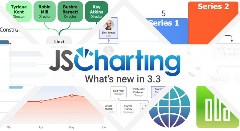
Version 3.4 brings new dashboard chart widgets with dark mode, vertical organizational chart layouts, slope charts, dumbbell charts, waffle charts, bullet charts plus new tick, axis and label features and much more. The JSCharting team crafted over 65 new examples highlighting the new chart widgets, chart types and new features for your own charts and dashboards.
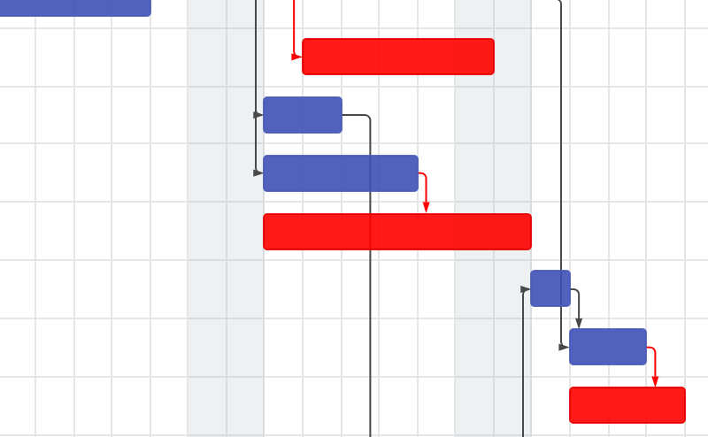
Organizational chart vertical leaf point layout
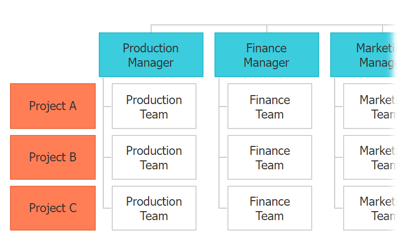
You can now optimize organizational chart layouts by stacking leaf points vertically. This can reduce the space required for the chart which is especially useful for larger organizational charts.
{
  defaultSeries: {
    leafPointLayout: 'vertical'
  }
}
New series and point defaultLeafPoint options
To help you work more efficiently with hierarchical charts, you can apply point options to only leaf points (points without any points below them in the hierarchy) or only apply options to leaf points that descend from a specific parent.
{
defaultSeries: {
defaultLeafPoint: {
color: 'blue'
}
}
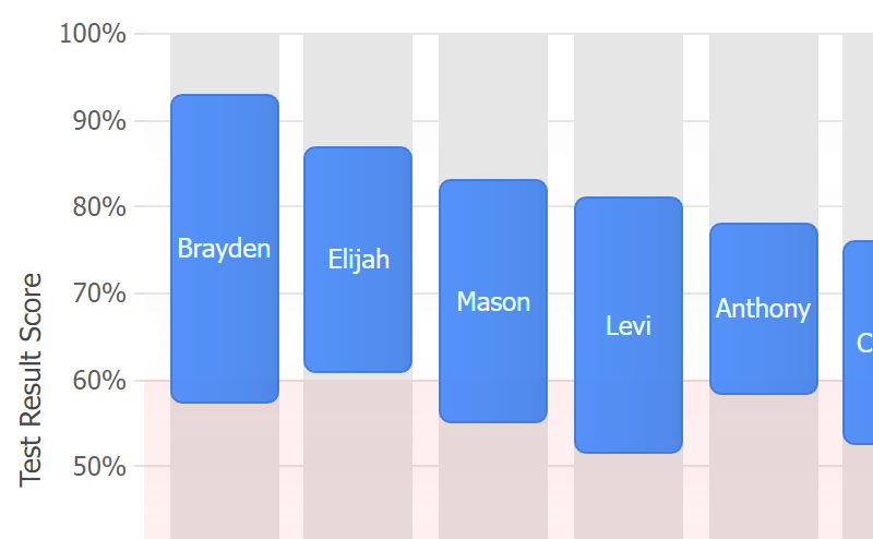
}Bullet Graphs and Charts
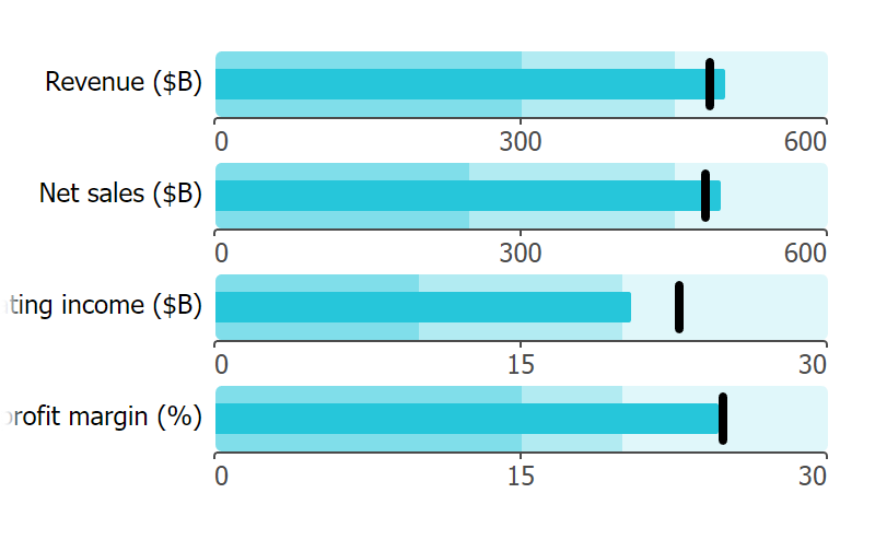
JSCharting supports a variety of bullet charts and graphs including bullet microcharts, full size bullet bars with targets and bullet graph dashboards.
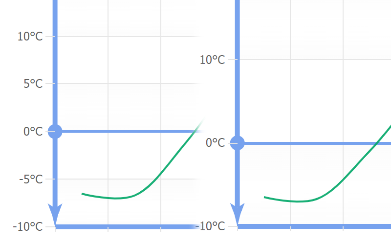
Slope Graph Examples
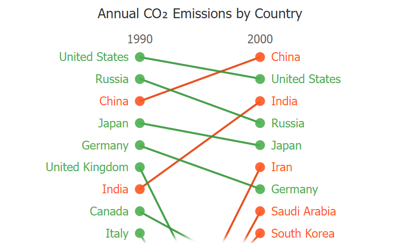
We enhanced the line chart to enable quick and easy slope graph creation. Slope charts are a compact visual ideal for dashboards and provide glanceable views comparing two points based on the slope of the line. Dual axis and category scale customization helps you create powerful slope charts that communicate values visually using a combination of labels, values and colors.
Dumbbell Charts

JSCharting 3.4 adds detailed Dumbbell chart examples (also known as known as DNA charts, barbell charts, gap charts or connected dot plots) including vertical dumbbell charts, multiple axis dumbbell charts and styled dumbbell segments.
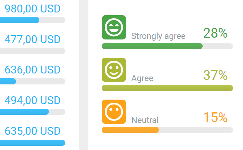
Waffle Charts

JSCharting 3.4 expands our waffle chart examples including use within organizational chart nodes. Waffle charts visualize data or completion using a grid of dots, tiles or colored cells and provide quick comparisons across values.
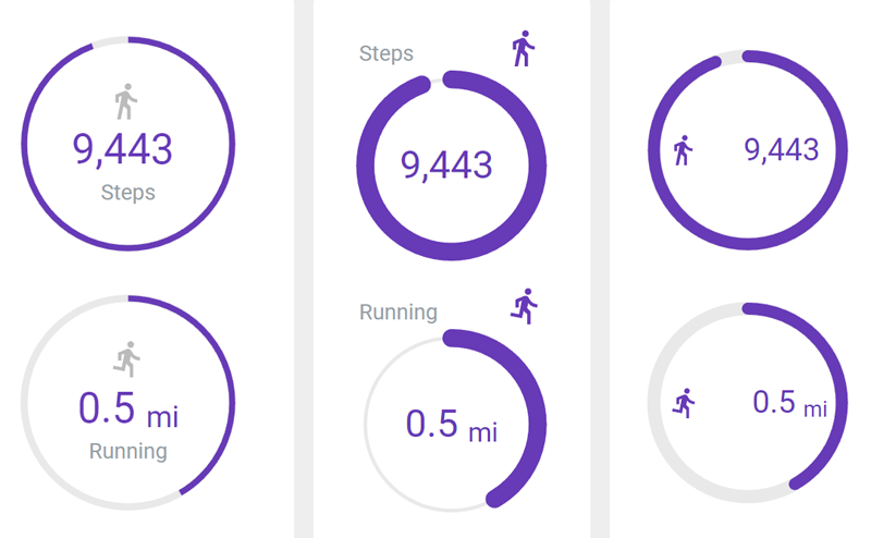
New widget module with a simplified API
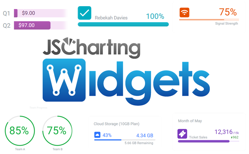
JSCharting 3.4 ships with a new widgets module that wraps a select set of charts with a simplified API. Combined with other smart optimizations, this makes simple dashboard style widgets more accessible without the steeper learning-curve of full featured charts.
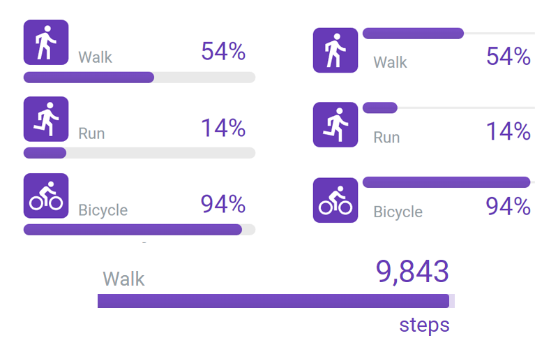
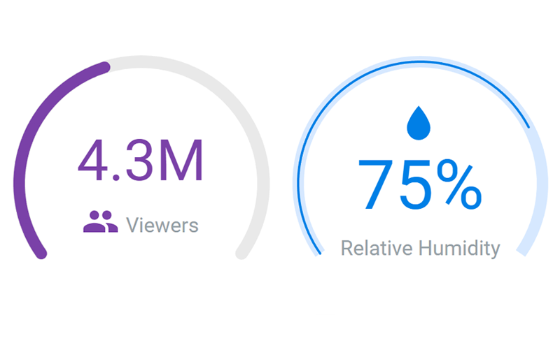
Three widget module types
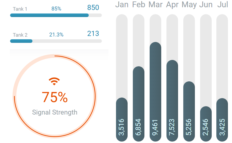
The new widget module includes Circular, Linear, and BarColumn types.
new JSCWidgets.Circular('div1', {
  label: 'Signal Strength',
  value: .75,
  max: 1
});
Advanced widget labeling support
Widgets have 3 labels: value, label, and icon you can customize with different text and positions. This leverages the new improved shape label layout and positioning options with a simplified API.
new JSCWidgets.Linear('div1',
{
  label: ['Walk', 'Run', 'Bicycle'],
  value: [.54, .14, .94],
  min: 0, max: 1,
  iconPosition: 'left',
  labelPosition: 'bottom left',
  valuePosition: 'bottom right'
});
Ability to style widgets with CSS
To improve widgets accessibility, we added support for styling widget text using CSS. Modify the provided CSS file to create new defaults or add new CSS to overwrite styling for specific widgets.
.jsc-widget .linear .title{
  font-weight: normal;
}
.jsc-widget .linear .value {
  font-size: 35px;
}
#div1 .jsc-widget .linear .value {
  font-size: 40px;
}
#div2 .jsc-widget .linear .value {
  font-size: 30px;
}
Widgets optimized for Dark or Light Modes
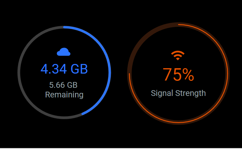
To make widgets more flexible out of the box, we have defined default colors and color opacities to work on dark or light backgrounds automatically. This helps simplify the creation of dark mode user interfaces.
New axis maxTickCount property
It is now easier to control the number of automatically generated axis ticks on a chart. Use the axis maxTickCount to specify the maximum number of ticks the axis should generate.
{
  yAxis: {
    scale: { maxTickCount:5 }
  }
}
Ability to center range tick grid lines
Sometimes, you may want a grid line to center on a range tick. For example, having a category line up with a column.
{
  xAxis: {
    defaultTick: {
      gridLine: {
        center: true, width: 'column'
      }
    }
  }
}
Improvements to multiple gauge layout
We enhanced the way multiple gauges and radars are laid out on a chart to make better use of the available space.
Improved shape label positioning
We completed a significant overhaul of the shape label positioning algorithm to handle many labels in different positions more reliably.
New positions for shape labels
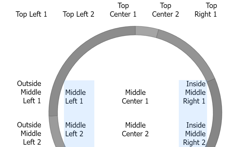
We've added new shape label positions “inside middle left” and “inside middle right” enabling you to add labels to gauges with more unique combinations and alignments.
{
  defaultSeries: {
    shapeLabel: {
      placement: 'inside',
      align:'left'
      verticalAlign: 'middle'
    }
  }
}
Use color modifiers with axis marker labels
We've improved axis marker label features to support relative color adjustments. Now you can set colors relative to other colors already defined such as marker colors.
/* Axis marker labels will use
* marker color but darker. */
{
  defaultAxis: {
    defaultMarker: {
      label: { color: 'darken' }
    }
  }
}
Ability to disable automatic label wrapping
You can now disable automatic label wrapping in all labels.
{
  defaultPoint: {
    label: { autoWrap: false }
  }
}
Reliably use maxWidth with labels
Want to limit label width? Use the maxWidth label option to reliably limit the width a label can be.
{
  defaultPoint: {
    label: { maxWidth: 70 }
  }
}
Label ellipsis text overflow support
We added support for ellipsis text overflow. You can now disable wrapping, set a maxWidth and ellipsis overflow to reduce the possible size of a label in a clean way.
{
  yAxis: {
    defaultTick: {
      label: {
        autoWrap: false,
        maxWidth: 150,
        overflow: 'ellipsis'
      }
    }
  }
}
Improved series.yAt(x) for ranged Y values
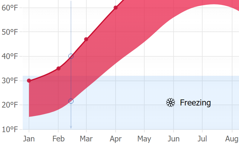
We've extended support for the series.yAt(x) function. Previously it only interpolated single Y values; but, now it also interpolates between ranged y values.
chart.series(0).yAt('2/15/2020');
// -> [22.344827586206897, 40.793103448275865]
Other
- More than 60 new examples.
- Bug fixes and performance improvements.
- series.points.add([]) Allows adding multiple points at once.
- Muted state for point.complete value visualization.
- Use series.points(date as string | number) to select calendar points.
- Chart level overlapBranding property so branded charts are the same size as non-branded.
- API documentation lists items alphabetically.