The bullet chart has been described as a secret weapon for effective and efficient financial analysts. Bullet charts can be used as an alternative to dashboard gauge charts and are ideally suited for use in dashboards visualizing KPI (Key Performance Indicators) where they excel comparing actual results to forecasts. Bullet charts are currently considered to be one of the most effective graph types in the world. The design and recent use of the bullet chart or bullet graph seek to do away with the traditional chart or graph visual overhead, which can make analysis difficult to accomplish. This relatively new chart type is seen as an advanced form of the traditional chart system as it offers users increased convenience and ease of use without distracting extraneous data visuals.
Designed and popularized by Stephen Few, the bullet chart takes inspiration from the regular bar graph but at the same time provides users additional context. The ability of the bullet chart to convey information makes it a better alternative to more traditional meter and gauge charts. While bullet charts can be viewed as simple bar chart or stacked column variants, the difference is that they are created with additional visual elements to offer additional context to users.
Bullet charts have proven to be ideally suited for any business dashboard data visualization. One of the main advantages of this chart over the gauge chart is that it doesn't take up much space within the dashboard as it is very optimized and compact. Aside from the fact that gauge charts take up more space, they can also be misleading especially if certain key points or values are omitted because of lack of space. While there may be some debate about gauge charts being misleading, there is general agreement the charts take up a valuable amount of space. Bullet charts have been designed for individuals that want to deliver all information and insight in one place without having to flip between pages and compare different visuals. A bullet chart contains the necessary information, while maintaining flexibility and visual space savings.
Components Of A Bullet Chart
There are three main components of a bullet chart. These components or markers are the main points where information and insight are recorded. They are:
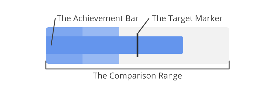
- The Target Marker: this marker is used to represent the main target or primary data point of the chart, business, or organization. The target can be anything you wish to achieve within a period of time. Depending on your requirement and need for the chart, you can have your target placed anywhere. The target marker or line marker is commonly known as the Comparative Measure and is used as a target marker to compare against the feature measure value or actual value / achievement bar.
- The Achievement Bar: this component has been designed to represent the actual value of the chart. This is real data that maps to the quantitative scale. When creating this bar, it is important that you give it a solid color while also making it more narrow. This is typically rendered as a black bar.
- The Comparison Range: this is the color theme that is used in the background of the achievement bar to display qualitative range scores. The main idea of this range is to simply create or make a comparison of the achievement for example poor, average or excellent on the qualitative scale. By using shading that is visually distinct the ranges can also work for color blind viewers and be read clearly in black and white hard copies.
These components make up the bullet chart as they contain the necessary information to be displayed. There is also a text label to describe the chart.
There are actually two types of bullet charts—vertical and horizontal charts. The information you have at hand will determine the type of chart to be used. Additionally, the available space is also taken into consideration when considering the type of bullet chart that is to be used. A vertical bullet has a vertical axis and includes the same performance measures as a horizontal bullet.
How To Create A Bullet Chart In Excel
Before we dive into how a bullet chart can be used, we'll discuss how one can be created. While a bullet chart may look easy to create, it is advised that you take into consideration the goals of the organization before creating a bullet chart. This is essential if you want to strike a balance. When choosing a target, it is advised that it is not one that can be attained easily as it often time breeds complacency. On the other hand, your target should not be an unrealistic one as it could discourage employees from doing their best. Your target should be one that is feasible for all in the organization to achieve within a period of time.
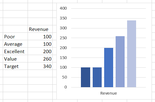
Step 1: Input Data
As mentioned earlier, there are actually three components of a bullet chart. Before going ahead to create one, you need to group the information at hand into these three levels. With the information at hand, you need to create a table that contains all the information in an appropriate manner or format data series which includes the values.
Once you have all the necessary information prepared on a table, you'll need to insert a column chart. To do this, go to your insert tab and click on "2-D Column".
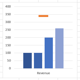
Step 2: Create A Target Marker
Your target marker will look like a horizontal line and to do this; you'll have to follow these steps:
- Select or choose your target bar. While the chart may be messed up right now making it unable for you to select a target, the trick is to pick a chart from the format option, then select or pick your target value.
- Once that is done, you move to the design, then click on "Change chart type."
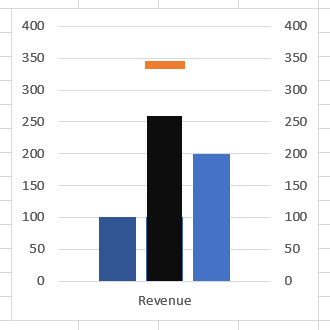
Step 3: Make Your Achievement Bar
As mentioned earlier, your Achievement Bar will need to have a solid color, which would be completely different from the comparison range. To do this, you'll have to follow these simple steps:
- Just as you selected the target marker, you have to select your achievement bar as well.
- Then, move to the series option and click on the "secondary axis."
- For now, you have to change the width to 500%
- To differentiate the achievement bar from the comparison range, you have to pick a solid color.
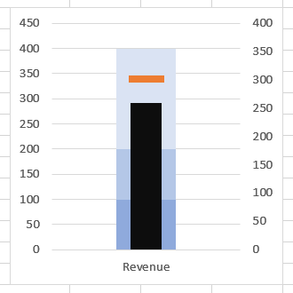
Step 4: Make The Comparison Range
To create a comparison range, you'll have to pick a color and make use of four different shades of the color. To help you do this, you'll have to select the colors one after the other.
Bear in mind that a bullet graph can either be horizontal or vertical in shape. As clearly mentioned above, the target of the organization must be feasible, and the right tools to reach the target should be provided for employees.
How to Make a Bullet chart using JavaScript
While excel does not natively support the bullet graph type, requiring manual creation, commercial JavaScript chart tools makes it as simple as supplying the data for the value, target and, optionally, any qualitative ranges (if not supplied they will be created automatically).
Step 1: Supply the data and display the finished chart in your web page

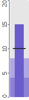
<chart type=bullet data=15,10>Creates a simple bullet chart with the first number being the actual value using a quantitative scale and the second the target or goal.

<chart type=bullet data=15,10,4,8>Define any number of qualitative scales by setting additional values. This example defines 2 which creates 3 (as the remaining empty area after the first two is the top range).

<chart type=bullet data=15,10,4,8 color=CornflowerBlue>You can also set the color and it will shade proportionally automatically.
Or you can specify all colors in use:

<chart type=bullet data=15,10,4,8 colors=MidnightBlue,Green,Blue,CornflowerBlue,LightSkyBlue> Finally, you can include a scale to go along with the bullet chart:
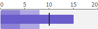
<chart type=scale data=0,5,10,15,20 min=0 max=20 size=200x20><br>
<chart type=bullet data=15,10,4,8 min=0 max=20 color=slateblue size=200x40>
How To Use A Bullet Chart
While we have discussed how to create a bullet chart, it is important that we discuss how you can make use of a bullet chart.
Bullet charts are useful in executive business presentations, dashboards, forecasts, to make targets, to compare real results, and more. They are also used to identify and measure the progress made by an organization or business. Bullet charts have been described as the best chart to use when it comes to illustrating results against goals that have been set.
Conclusion
The beauty of the bullet chart is that it is simple to read and understand, avoids extraneous information and detail, and offers quick and accurate information at a glance without confusion. The type can be created by most chart tools, including MS Excel with some additional work, while many commercial tools have built in support.