Version 3.0 includes major new features including the Venn chart type, RTL (Right-to-left) language support, advanced highlight and selection and much more. New interactivity and event features provide seamless data highlighting and UI interactions. The JSCharting team has included advanced dashboard examples using the new version 3.0 API, allowing you make your own high performance dashboards quickly and easily.

50+ New Tuned Examples
JSCharting 3.0 includes over fifty new and highly tuned real-world samples which can be used like chart templates to accelerate your custom data visualizations.

RTL Text Support
JSCharting now offers full right-to-left language support. The chart will automatically apply this feature when a culture string is defined. For example: defaultCultureName: 'he-IL'

Chart Wide Performance Improvements
Chart performance has been enhanced across all chart types and interactions. On average, charts should see a 10% increase in rendering times. And sometimes much more.

Chart Mentoring, Tips and Suggestions
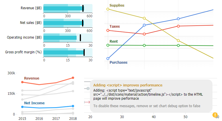
If the debug: true chart option is set, the chart will attempt to detect common chart issues and suggest solutions. When issues are detected, a light bulb icon will appear on the chart with suggestions when you hover it. This feature is in the early stages of getting built out—Look for more expansive issue coverage in upcoming releases.
 Utility Function")
JSC.sortBy() Utility Function
The need to sort data points is common when authoring charts. We added a built-in sorting utility function to make sorting quick and easy. For example:JSC.sortBy(points, 'y')
JSC.sortBy(points, 'attributes.age')
JSC.sortBy(points, ['attributes.age', 'name'])
Note: The array used as an argument is not sorted, instead a new sorted array is returned by this function.

DataGrid Title
A title can be added to data grids.

Export Events
beforeExport and afterExport events have been added, enabling customization and configuration of charts for export and printing.
New Point Token: %parentId
This new string token can be useful with organizational charts.
Visualization

A new Venn and Euler diagram chart type has been added. You can use this chart by setting the type: 'venn' chart option. The series data used determines whether a Venn or Euler diagram is drawn. An additional point.sets property is available to define venn data. Here's an example of venn data: {name: 'Landing pages', sets: ['Website', 'PPC'], y: 2}

Automatic Color Blending
By default, Venn diagram data points that are made up of two or more overlapping shapes will inherit a blend of the underlying colors. To disable this behavior and assign a unique color to each data point, use the chart option type: 'venn colorbypoint'.
Alternate point color (point.altColor)
An alternative point color option has been added to provide more flexibility with how data points are visualized. This is supported in the following usage cases:

Secondary color for activity rings when they overlap
Circular column gauges (activity rings) alter in hue when rings overlap. This option can be used to disable this color change with: point.altColor: 'currentColor'. Or to customize a color shift when rings begin to overlap.

Control Candlestick Alternate Color
The alternate color used by candlesticks when close price is below open price can be modified or disabled using this option.
")
Colored OHLC Bars (defaultPoint.altColor)
Similar to candlesticks, OHLC bar data points can now use an alternate color when the point closes lower. Setting the point.altColor property is required for this option.
")
Label Stroke (label.outline)
All chart labels now support an outline option. Whenever labels become difficult to read because they blend into a background color, you can apply a label outline to ensure the labels have plenty of contrast.
")
Post Animation Update Callback (updateOptions.then)
This option provides a way to continually update a chart with animation without compromising performance on slower machines or sacrificing update speed on more robust client devices. When updating the chart, you can use a callback update option that will execute when the chart animation is complete.
Selection/Highlighting
A major feature of this update is series and data point highlighting, including a more robust selection feature set, and enhanced events.
Data Visual Highlighting (by muting others)
Point and series highlighting is automatically enabled when hovering legend entries and point axis ticks. It is also available when hovering data points, but not automatically enabled except with Venn chart type. To enable highlighting when hovering points, use this setting: { defaultPoint_hoverAction: 'highlightSeries' } To disable default highlighting behaviors, use:
{
	defaultSeries_legendEntry_hoverAction: false,
	defaultPoint_yAxisTick:{
		label_text:'%name',
		hoverAction: false
	}
}
3 Highlighting Modes
Three highlighting modes are available and can be used with any objects.highlightSeries - Mutes all data except the points of the series being hovered.highlightPoint - Mutes all data except the hovered point.highlightPointGroup - Mutes all data except the point group being hovered. A point group refers to points across all series that share the same x value or name.

Point Selection Modes
Point selection can now be configured with a number of options.'auto' - (Default) Uses single or multiple selection mode while CTRL (command on a Mac) is pressed.'single' - Only one point is selected at a time.'multiple' - Multiple points can be selected at a time. Click points again to deselect.{ max: 3 } - Specify an arbitrary number of points at a time using FIFO (first in, first out) logic. Clicking a point beyond the maximum number will select the new point and deselect the first point selected.
New Data Selection Events
Two new selection events have been added to make reacting to data selection simpler in many scenarios.These events are debounced in case selection occurs programmatically and repeatedly to ensure they are not triggered more often than necessary. As a result, there is a minor (30ms) delay between selection and when the events are triggered.
pointSelectionChanged
The pointSelectionChanged event is triggered when selected points change. The handler is called with a list of currently selected points passed as the argument.
seriesSelectionChanged
The seriesSelectionChanged event handler is triggered when the series selected state changes. The list of selected series is passed as an argument.

Legend Checkbox
The legend checkbox is now integrated into the chart as an option. Checkboxes can be enabled by setting legend_defaultEntry_checkbox_enabled: true. Or the '%checkbox' token can be used in legend entry templates.
For series legend entries, the checkbox will represent series visibility by default. Point entry checkboxes will represent the point selected state by default.
Checkbox behavior can be modified for series and points, and custom checkbox behaviors can be implemented for all types of legend entries.
Solid series and point states

Point/Series selected and muted properties
You can now set point or series selected and muted states programmatically to implement customized behavior for many edge case scenarios. For example, this code selects all points of the first series in the chart. chart.series(0).points().options({selected: true})

Simplified State Settings
Some state settings have been simplified making it more convenient to control state visuals. For example this setting will apply the same opacity to the series line, and point markers when hovering a point: { defaultSeries_states_hover_opacity: .5 }
Axis Features

Simpler Additional Axis Logic
Adding extra axes is simplified in this release. Axes now sync with the main axis automatically. You no longer have to specify scale_syncWith = 'axisId' to sync scales with the main axis. On extra axes, defaultTicks (a copy of the main axis ticks) are disabled unless defaultTick settings are used. In that case, setting defaultTick_enabled: false will prevent the main axis ticks from appearing.

Arbitrary Axes on Charts
When you add extra axes with scale_range: [low, high] setting, the axis will not be synced to any scales. You can then specify an interval to draw gridlines and ticks for any custom purpose.

Scale range padding and min or max
You can now set the axis scale padding for one side, while locking the other side of the scale. This will prevent the padded side from snapping to axis ticks and will keep the data an even distance from the edge while a static minimum or maximum value is applied.
scale_range:{ padding: .2, min: 0}This is useful with dynamic charts like bar run or race charts to make animation smoother.
Axis Tick Enhancements

Closest point gets the tick
Consider this setting:
defaultSeries_lastPoint_yAxisTick_label_text: '%name'
It marks the last point of each series on the y axis. A number of last points might end at this same y axis position. JSCharting will display the point that is closest to the axis. As a result, if you move the axis to the other side with setting yAxis_orientation:'opposite', you may have different points shown on the axis.

Click, mouseOver, mouseOut events
General axis tick events have been added so that interactivity can be implemented for any ticks on a chart. This is especially useful when axis ticks are bound to data points where point axis ticks can behave like legend entries.

Highlighting on Point Axis Tick hover with hoverAction options
One legend entry type behavior is now automatically used with point axis ticks. If you hover these ticks, it highlights the related series. In addition, you can use the axis tick hoverAction property to control the highlighting behavior. Setting false disables it, while 'highlightSeries', 'highlightPoint', 'highlightPointGroup' defines what will be highlighted on hover.
Tooltip Improvements

Better positioning
We implemented significant enhancements to the tooltip positioning system. Tooltips are now more aware of the items around them and the target point. As a result, tooltips will find even more ideal positions, resulting in more readable charts for your users.

followCursor
Some scenarios where points are bunched together (such as on maps or heatmaps), offer no good positions for tooltips to show. A followCursor mode has been added to give the user more control in these scenarios. Users can adjust tooltip positions by simply moving the cursor. This mode is set automatically for series types including organizational, map, and heatmap charts.
Interactivity

Events inside labels
If you are creating a more complex interactive chart, please review this organizational chart designer sample. It demonstrates how you can add multiple icon buttons to point label text and how to perform different operations based on the clicked icon.
General UIItem Event Improvements
A number of general uiItem event enhancements have been added, making events more consistent and reliable.
Point Cursor Setting
The cursor can now be set for individual data points providing more detailed control over desktop interactions.
UIItem Slider Debounce Option
As an alternative to the slider throttle option, the debounce feature will prevent the slider update event from executing until a specified number of milliseconds has lapsed without any further updates. This can be more effective than throttle in smoothing slider action when your updates are more CPU intensive.