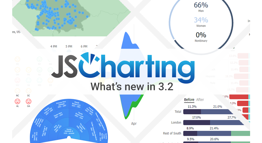
Version 3.3 brings major new organizational chart and Gantt Chart expansion including Gantt critical path charts, org connector line styling and selection, dashboard widgets, pictogram charts and much more. Chart gradient support is expanded to include icons and dynamic point and series gradient fills. The JSCharting team crafted over 55 advanced examples with the new features, chart types and chart widgets allowing you to quickly and easily leverage all the new functionality in your own high performance charts and dashboards.

Gantt chart critical path support
New connector styling support for Gantt charts lets you customize and highlight a Gantt chart’s critical path.
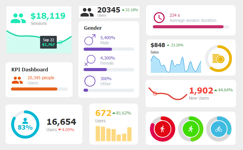
Widget charts for dashboards
15 new dashboard widget chart examples from linear gauge to columns and bars, circular gauge with icons to full bleed area lines, typographic widgets and line chart widgets with change indicators help you quickly and easily build custom chart dashboards.
Pictogram charts and pictographs
JSCharting’s integrated icon support provides a huge selection for pictogram charts and graphs. Pictogram bars and percentage charts combined with strong typography create glanceable charts that convey their data quickly and easily.
Ability to set multiple parents and connector styles per data point
We enhanced the point.parent property to help you define multiple parents and connector line styling for each parent independently.
parent:[
{id: 'p1', line: {color: 'green'}},
{id: 'p2,p3', line: {color: 'red'}}
]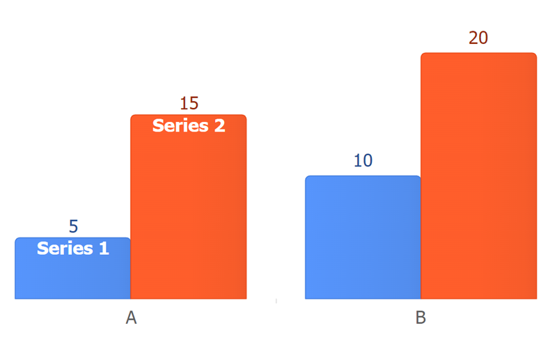
Define axis categories
We added a new axis.categories property so you can define data point category names only once and have more control over the sort order. For convenience, you can specify an array of y values for the series.points property.
Before
series: [
{name: 'Series 1',
points: [{x: 'A', y: 5}, {x: 'B', y: 10}]
}, {name: 'Series 2',
points: [{x: 'A', y: 15}, {x: 'B', y: 20}]
}]
After
xAxis_categories: ['A', 'B'],
series: [
{name: 'Series 1', points: [5, 10]},
{name: 'Series 2', points: [15, 20]}]
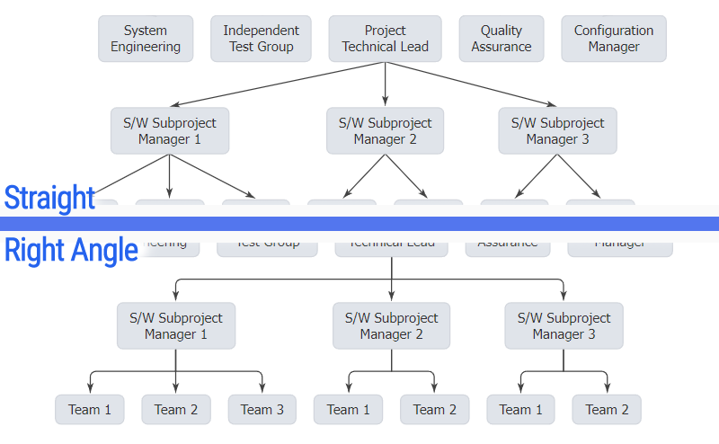
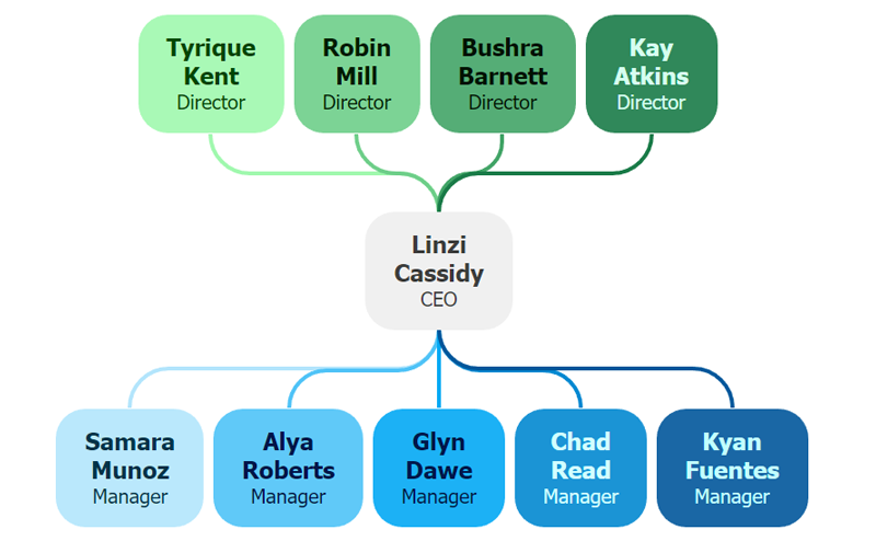
Right-angle or straight organizational connector lines
We enhanced how organizational connector lines appear by drawing them at right angles by default. You can use the straight option to change this default and draw connector lines directly between points.
type: 'organizational straight'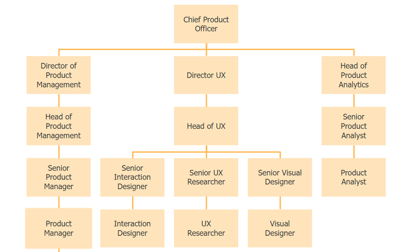
Synchronize organizational node widths and heights
We added point.annotation.syncWidth and syncHeight properties to help you control the sizing and visual balance of organizational chart nodes.
defaultPoint_annotation: {
// syncWidth: true == syncWidth_with: 'level'
syncWidth_with: 'level',
syncHeight_with: 'all'}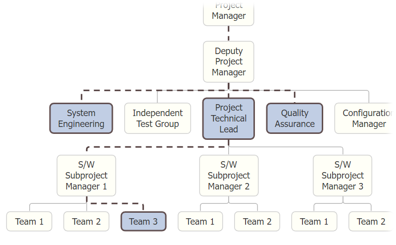
Point hierarchy connector styling and selection
There is now a way to select specific branches in an organizational or Gantt dependency chart using hierarchy path selectors. You can select all branches from a point up the hierarchy, down the hierarchy, up and down, or between two points. For example
// All branches from pointID up the hierarchy.
['pointID', 'up']
// All branches from pointID down the hierarchy.
['pointID', 'down']
// All branches from pointID up and down.
['pointID', 'both']
// All branches between pointA and pointB.
['pointA', 'pointB']
// A specific branch of points.
['pointA', 'pointB', 'pointC']
// Multiple branches and selectors.
[['pointA', 'pointC'], ['pointC', 'up']]
Use the chart.connectors() function with path selectors to style the connecting lines. The chart.connectors() function lets you get a list of paths based on the selection, modify the connector line styling for specific paths, and reset connector styling to the original style.
// Styles all connector lines from pointA up the hierarchy.
chart.connectors(['pointA', 'up'], {color: 'red'});
// Reset all previously applied line styling from pointA up the hierarchy.
chart.connectors(['pointA', 'up']);
// Reset all line styling previously applied by this function.
chart.connectors();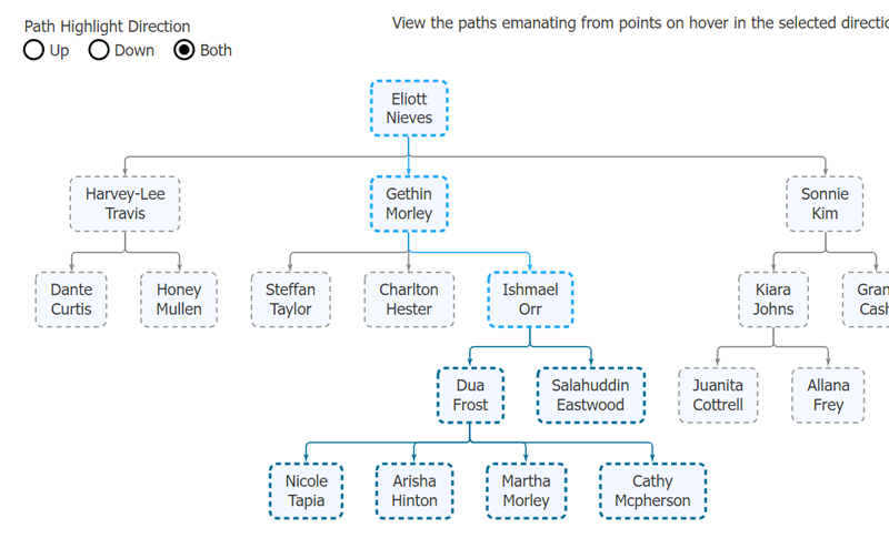
Ability to use hierarchy selectors to get points
In addition to styling connector lines using path selectors, you can use them to get a collection of all points included in the selected paths. For example, this applies the selected state to all points within the [‘pointA’, ‘up’] branches.
chart.series()
.points(['pointA', 'up'])
.options({selected: true})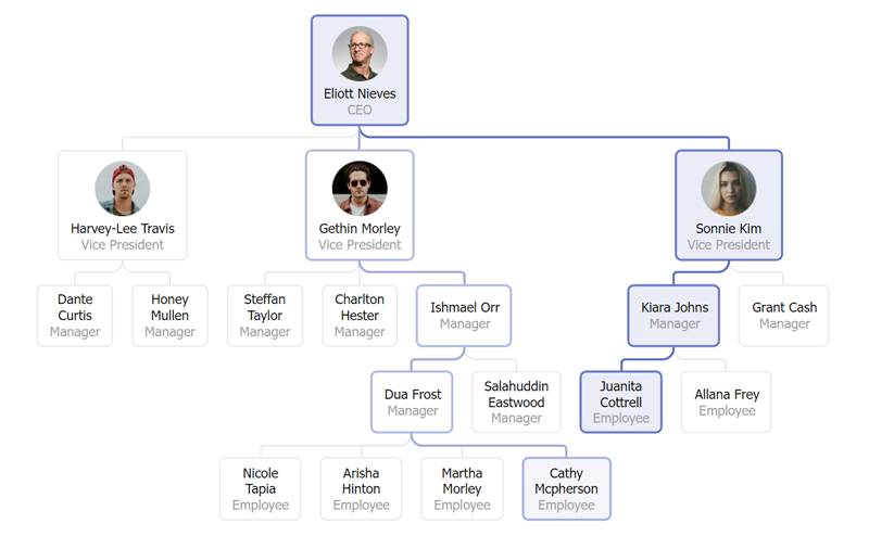
New point.connectorLine property
You can now specify organizational or Gantt chart connector line styling per data point, or as a default for all points.
defaultPoint_connectorLine:
{color: 'blue', width: 2}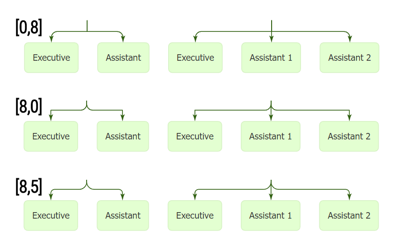
New connector line radius option
We added a connector line radius property to control the rounded corners of organizational connector or Gantt dependency lines. You can also provide an array of two radii for the chart to apply a different radius for each corner along the line.
defaultPoint_connectorLine: {radius: 5}Radius for each corner.
defaultPoint_connectorLine: {radius: [0,5]}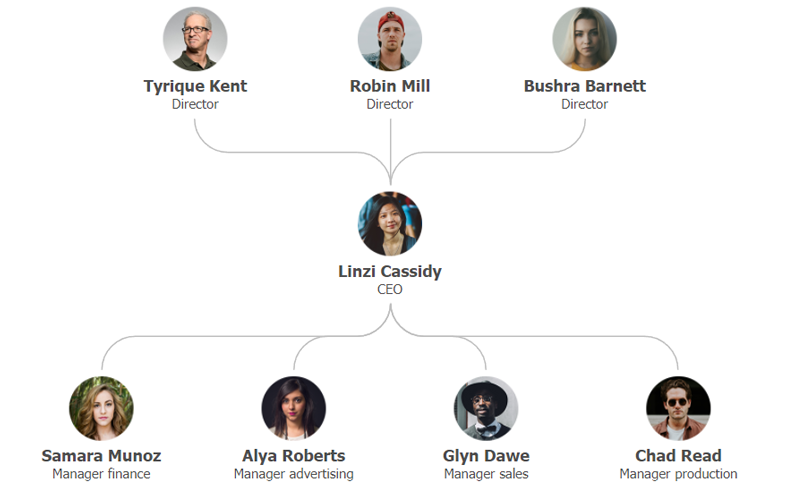
Point getParents() and getChildren() functions
Need to manually traverse data points in an organizational chart? Now you can use the getParents() and getChildren() point functions to get collections of points immediately up or down the hierarchy tree.
chart.series()
.points(0)
.getChidren()
.each(p => console.log(p.name));
Linear gradients for <icon> tags
Did you know icons can be used inside any chart labels? JSCharting 3.3 now lets you define rich gradient fills for these icons by specifying a list of colors and an angle as shown below.
label_text:
'<icon name=[name] fill=#c41111,#ec5a5a,90>'
Dynamic gradients
We expanded gradient color handling with color adjustment values to help you define gradient colors more easily. After you specify a first gradient color, you can set the rest to any of the color adjustment values.
label_text:
'<icon name=[name] fill=#c41111,lightenMore,90>',
fill: ['#c41111', 'lightenMore', 90]
Dynamic gradients for area chart fill
We’ve expanded dynamic gradient support to the series.shape.fill property. You can set all gradient colors in this property to an adjustment value, including ‘currentColor’ which refers to the series color.
defaultSeries_shape_fill:
['currentColor', 'white', 90] or
['currentColor', 'lightenmore', 220]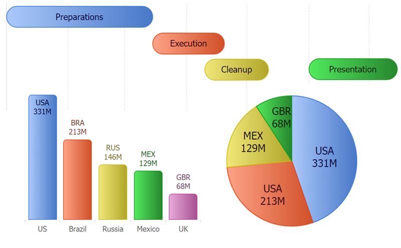
Dynamic gradients for data point fills
You can now use color adjustment values in data point fill gradient colors.
defaultPoint_fill: ['currentColor', 'white', 90]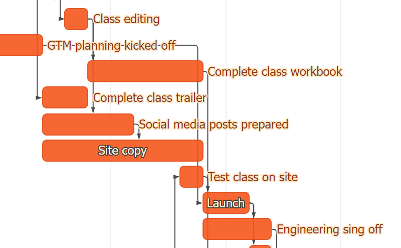
Dynamic label outline color
JSCharting improves legibility by intelligently selecting data point label colors that contrast with their background. When text overlaps areas such as connector lines, fills or gradients, you can use a text outline with an adjustment value color. This adjustment is based on the automatically selected label color.
defaultPoint_label:
{outline: {color: 'contrast'}}
Sync grid line width with columns
We added support to set axis tick grid line width to 'column' in all axis scale types. You can use this with crosshairs, which are axis ticks, or to style column charts to look like progress bars.
xAxis_crosshair:
{enabled: true, gridLine_width: 'column'}
Data object paths for nest()
JSCharting now includes support for object property paths in nest key() and rollup() functions. You can use this utility to process your data into groups and extract complex details to visualize on charts.
let dataGroupedByRoles = nest()
  .key('attributes.role')
  .entries(myData);
Map Zoom Button Position
JSCharting 3.3 allows you to modify the default map zoom buttons position.
toolbar_items_zoom_position: 'inside top right'Next.js Support
This release includes fixes and enhancements enabling JSCharting to work in the Next.js environment.
Other
- Organizational connector line pixel snapping.
- Organizational chart node labels are centered by default.
- Improved organizational chart default view position when zoomed in.