At the beginning of March we launched a Charts for Charity campaign with all proceeds donated to support water wells and sanitation in Africa. After watching COVID-19 grow into a pandemic touching every country in the world, we have renewed this campaign to help raise awareness and funds for COVID-19 Relief.
COVID-19 Dashboard Goals
The JSCharting team created an advanced interactive COVID-19 dashboard to help raise awareness and inform safe choices, for citizens throughout the world, as we unite to fight COVID-19.
By translating raw data into easily understood interactive visuals, we hope these insights help us avoid each other’s missteps while celebrating and replicating our successes world-wide.
Dashboard Walk-Through
Summary Tab:
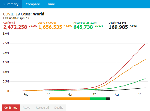
The summary tab shows an at-a-glance view of global statistics, including details on the total confirmed COVID-19 cases, active cases, recovered cases, and deaths to date.
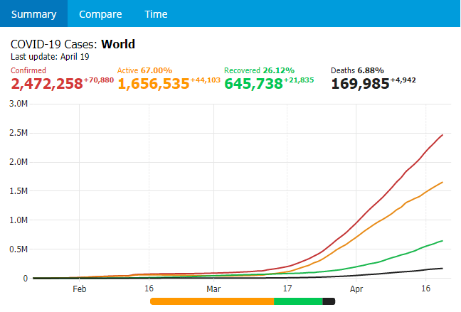
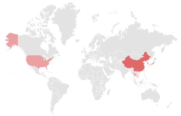
The +/- superscript number shows the change in the last day, while the percentage shows the portion of confirmed cases that are still active, have recovered, or died. To view a summary for any specific country, select the country on the map below the line chart. For example, China:
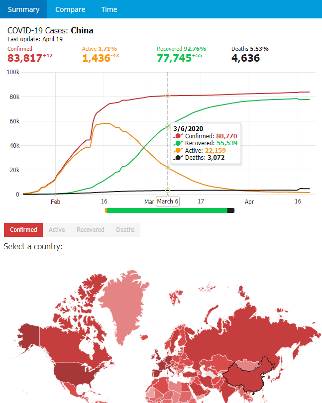
The chart above shows the drop in active cases and corresponding rise in recoveries as strong social isolation measures were put in place. Hovering over the lines on the chart shows a combined tool-tip with specific values per day. On a mobile device tap and drag on the chart area to show tool-tips.
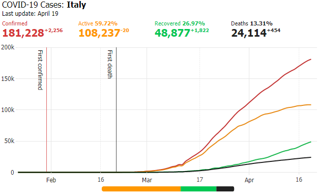
The above summary for Italy shows they are earlier in their recovery, yet active cases can already be seen dropping as the curve flattens, reducing the load on their health care system. A stacked bar chart is displayed under the summary line chart showing the proportion of current active cases, recovered cases and deaths for the selected country.
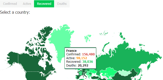
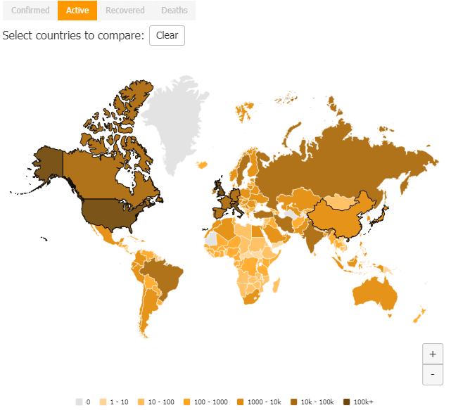
Below the summary line chart is a global thematic map shaded based on cases. Here you can select between colored tabs for Confirmed, Active, Recovered and Deaths and hover over any given country for a tool-tip summary. This map is green, indicating that it is displaying the number of recovered cases in each country. The darker the color, the greater the number of recovered cases.
To more easily view or select geographically small countries, you can zoom using the +/- icons on the map and click and drag to pan the map.
Compare Tab:
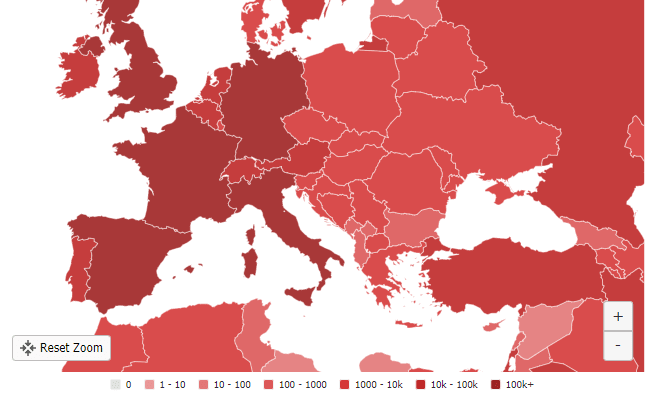
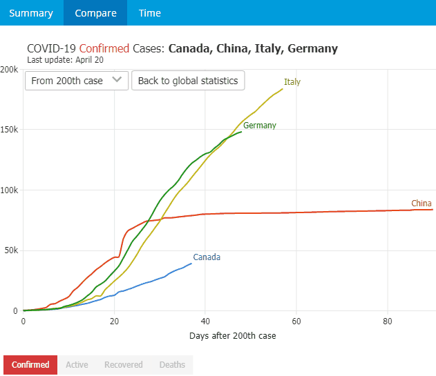
Jumping to the top level Compare tab, this enables detailed country comparisons with options for displaying results from 1st day, 10th case, 100th case and 200th case. This helps to align data and compare countries of interest to others where outbreaks started at different times.
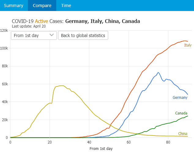
Switching between colored tabs will change both the country comparison line chart and the thematic map to show confirmed, active, recovered or death data.
Time Tab:
The time tab shows temporal views including thematic maps for the total confirmed cases, active cases, recovered cases and deaths.
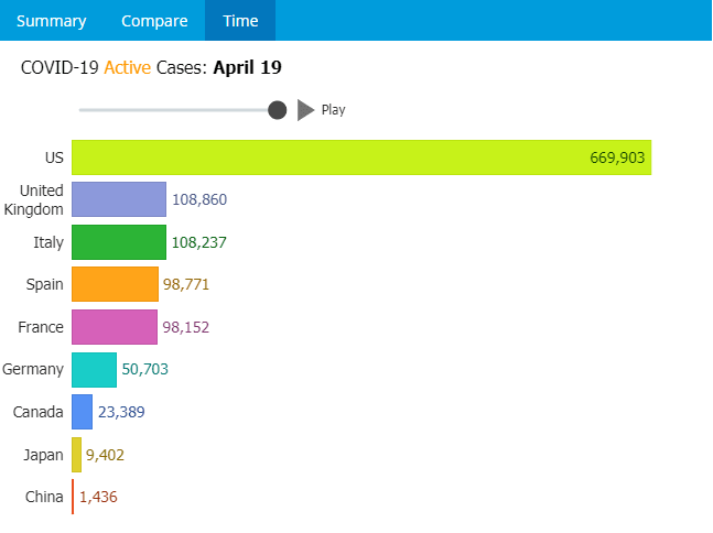
Clicking the play button will play back the changes over time - both in the thematic map and synchronized with a bar chart race where the highest values jump to the top. These animations help visualize the growth over time between different countries. While the animation plays back over time, you can continue to add or remove countries of interest. You can also click between the colored tabs and drag the date slider to play back from the start of the pandemic to visualize the spread of COVID-19 over time.
Updated Daily
Dashboard data is updated daily from Johns Hopkins University Center for Systems Science and Engineering. Developers interested in doing their own visualizations can download the raw coronavirus data here.
What you can do to help
1) Developers needing a JavaScript chart library can Pay What You Want for the 8 in 1 JSCharting bundle with all proceeds donated to COVID-19 Relief.

2) Share the interactive dashboard with friends, family and through social media to help spread awareness.
We want to hear from you!
Have an idea for how this dashboard could be improved? Is there another important topic you would like to see visualized? Please let us know!