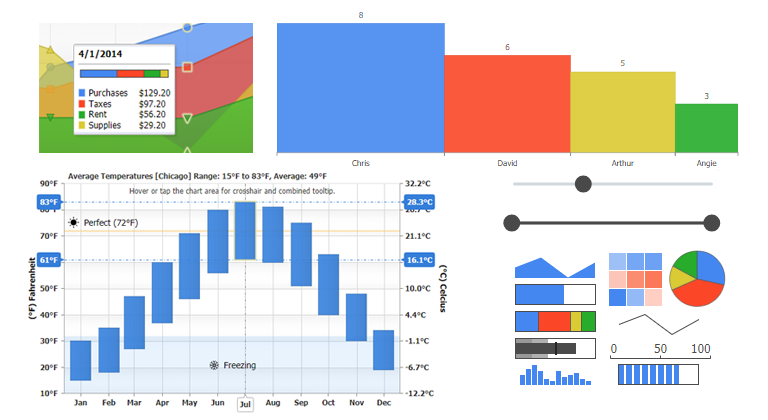
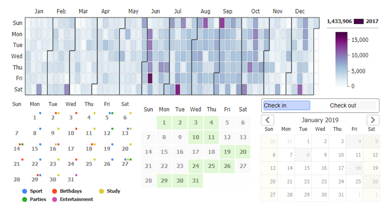
Version 2.8 is one of our most significant releases to date. The JSCharting team focused its energies innovating the chart axes, accessibility support, a seamlessly integrated datagrid control and many more additions. We are excited to present these new features and look forward to seeing what our clients will be able to accomplish with them!
Reimagining the Axis
Axis Range Ticks
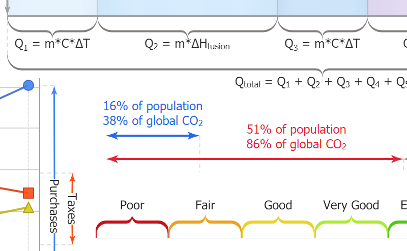
'Range ticks' may sounds contradictory at first, but are a powerful new addition for axis labeling. Axis ticks traditionally refer to a specific point on an axis scale; however, now have gained the ability to define a range. Simply specify an array of two numeric values in place of a single numeric tick value to enable the range axis tick visualization. Range ticks can display with three different visualization styles and will select the optimal mode automatically while also allowing for manual configuration.
AxisTick CalendarPattern Values
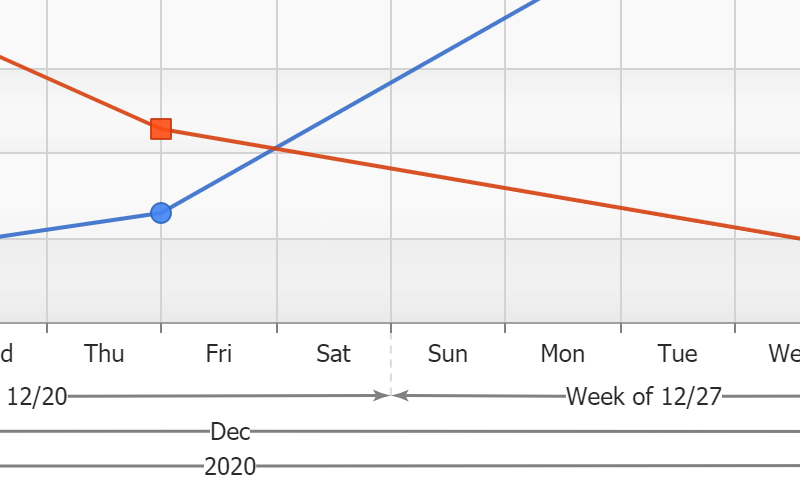
Combining CalendarPatterns with axis range ticks provides a new and compelling way to visualize time scales. Enabling range ticks to be automatically drawn for every month, quarter, year (or any other interval) is as simple as adding one line of code!
AxisMarker CalendarPattern Values
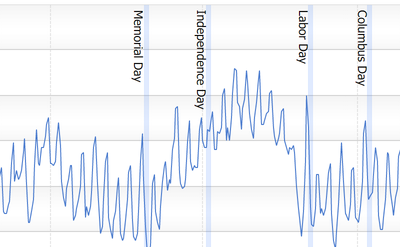
CalendarPatterns are a powerful shorthand API enabling you to define complex date patterns (such as rules for national holidays) or interval based patterns (such as weekends). These patterns can now be specified as axis marker values to mark important dates that may correlate with your data.
Category Scale Names == Ranges
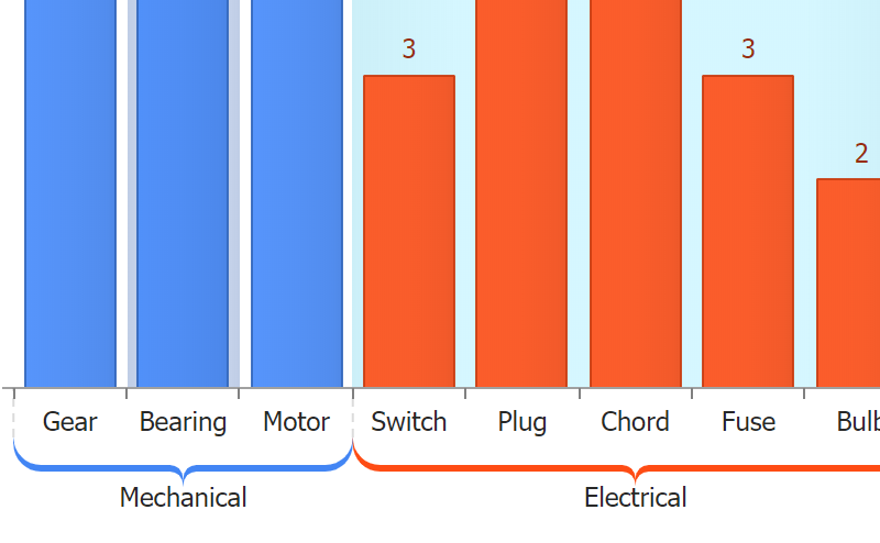
JSCharting v2.8 introduces a new concept for category scales. String category names no longer refer to a single point on an axis, but rather a range. AxisTicks and AxisMarkers now accept either category name values or two category names that refer to a range that encompasses both categories.
Logarithmic Scale Improvements
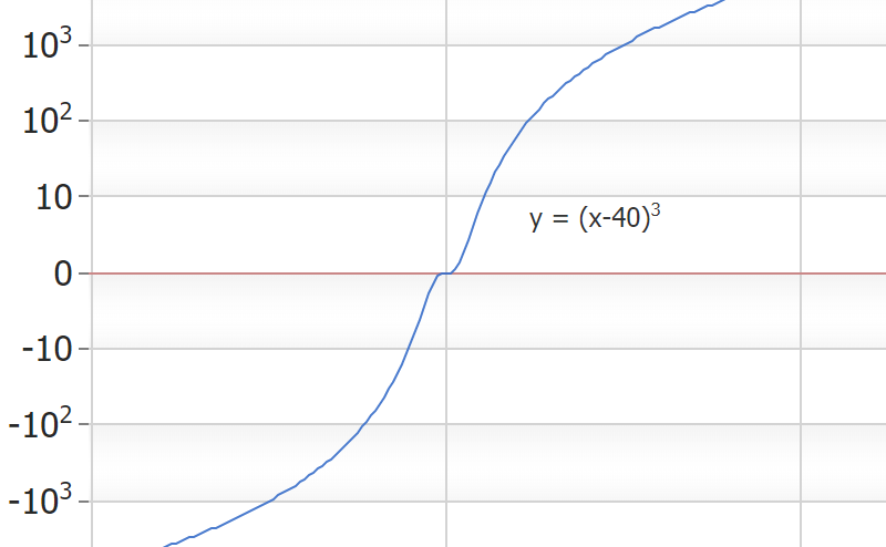
Logarithmic scales now support zero and negative values. In addition, exponent format string 't' support is now available to shorten the large numeric axis values that often appear in logarithmic scales.
Point Axis Ticks
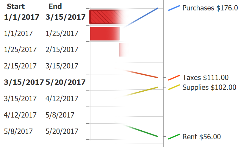
This feature automates complex coding tasks through a very simple API. A xAxisTick or yAxisTick property can be set directly on any data point (or the default) configuration object which adds an axis tick bound to point itself. The value of this tick will automatically be set to the point value and the tick label includes seamless support for point tokens that describe the point.
The example on the right is achieved with this simple code:
{
    x:'10/20/2020',
    y: 176,
    yAxisTick:{label_text:'%icon %seriesName %yvalue'}
}
Axis.caOffset property
The addition of range tick visualizations introduce a powerful new tool to describe sections of a scale. An axis that includes these visuals can now be positioned inside the ChartArea (negative px offset) or to a specific position outside the ChartArea (positive px offset) to gain more control of range and value tick layout.
Axis Number Shortening and Magnitude Formatting
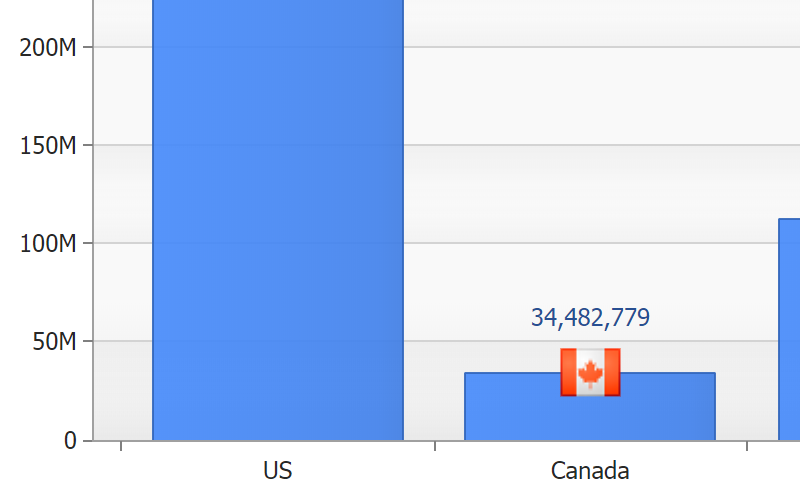
Large numeric values, which take time to read accurately, waste a lot of screen real estate.. Now, the axis can automatically shorten these values so that 56,000 turns into 56 k, 1,000,000 becomes 1M and so on. This formatting option is also available as the 'a' format string and can be used with any labels outside the axis. When a number is added to the format string such as 'a2', it refers to a specific magnitude.
Introducing the Datagrid
Datagrid Control
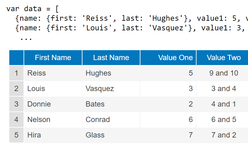
Version 2.8 introduces a powerful and tightly integrated data grid that binds to JSCharting charts and also acts as a stand-alone grid connected directly to your data.
Microchart and Icon Syntax
The simple syntax that allows microcharts to be added to any label on a chart is also supported in datagrid cells. In addition, JSC’s icon syntax provides access to the full library of icons for seamless usage in datagrid cells.
Token Formatting and Expressions
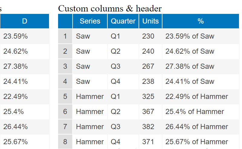
The same formatting and expressions syntax supported within chart labels can now be used to define data grid column values.
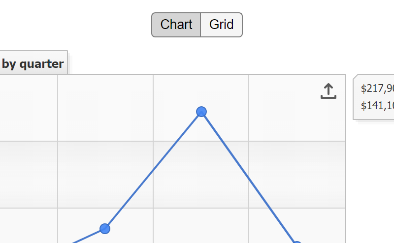
Chart to Datagrid
An existing chart can show an alternative data grid of the charted data by simply setting the datagrid_enabled config option to true. A chart can also populate any div on the page with its data using the chart.toGrid('divId') function.
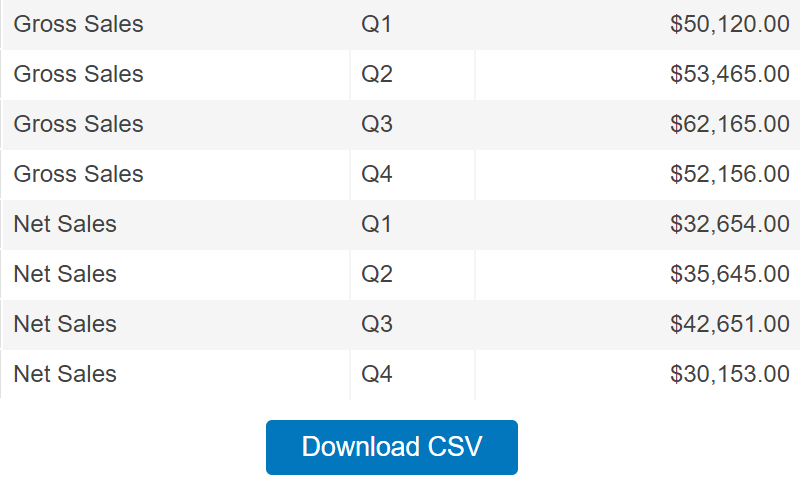
Export to CSV
When the datagrid CSV export option is enabled, a convenient button is generated that will save the data as a CSV file on the client's computer.
Tooling Harmony and Automation
The recent enhancements and support for delimiter separated value formats such as CSV can now plug directly into stand-alone data grids. This powerful combination can automatically detect CSV headers and interpret data to display the results as intended without intervention or additional manual settings.
More Features
Accessibility
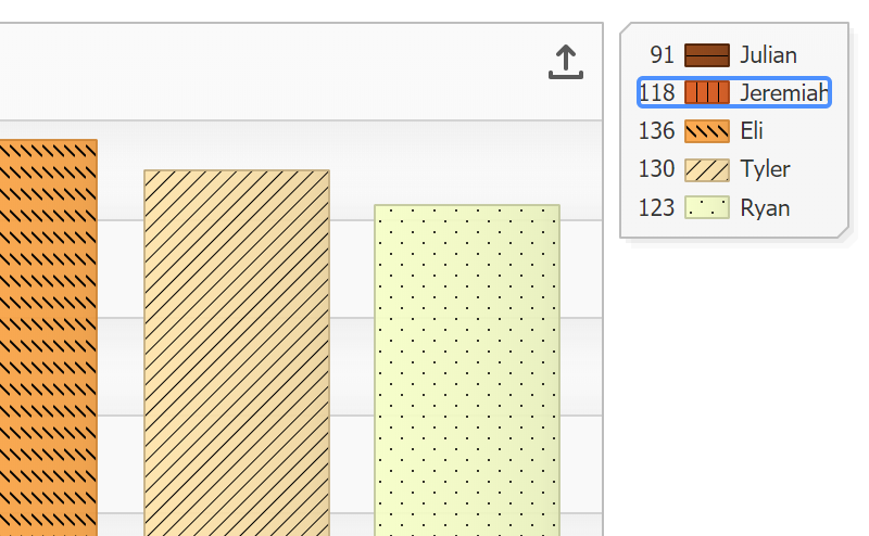
When accessibility is a company-wide requirement, JSCharting offers an uncompromising solution. Whether your organization must comply with section 508 or WCAG 2.0, you now have access to all the options to enable and control your chart accessibility experience. In addition, color palettes optimized for color impaired viewers have been added to further enhance accessibility regardless of the specific form of color impairment.
Gantt Dependencies
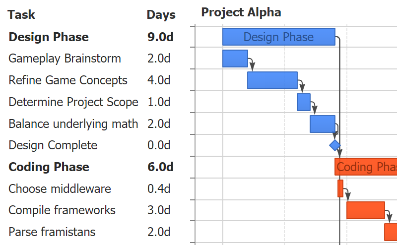
The advanced Gantt chart capability of JSCharting is now even more powerful. Project task dependencies for critical path analysis can now be visualized on Gantt charts. Starting tasks can be set to depend on the completion of another task or a number of other tasks as a group.
Line Caps
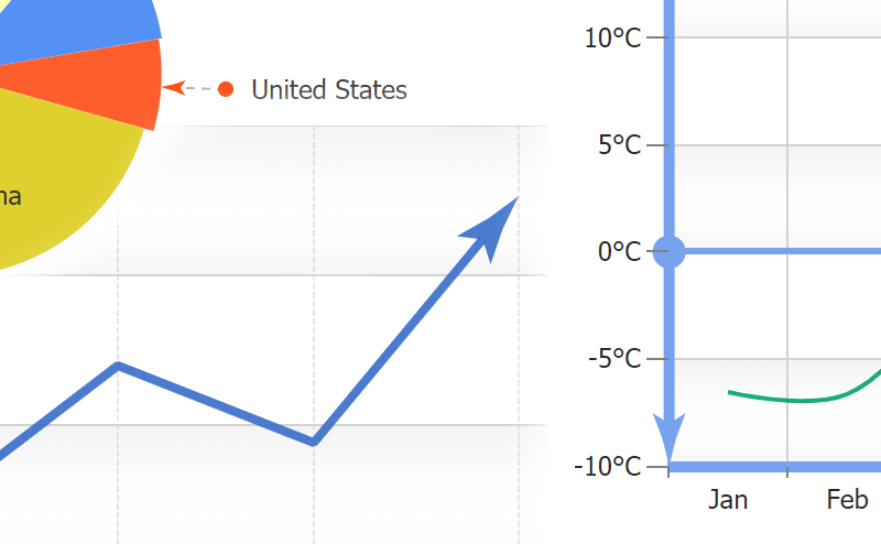
Line caps add deeper meaning and context to ordinary lines by communicating line direction, colors and symbols. Line Caps are automatically set to enhance visualizations such as Gantt dependencies and range ticks and can also be set for other lines on the chart (even on line series).
Superscript and Subscript
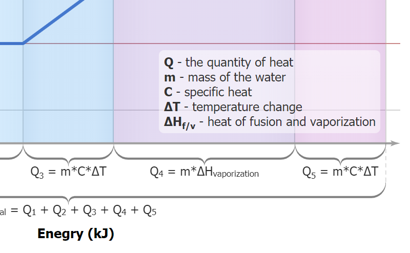
Superscript and subscript text is useful for many advanced labeling needs and avoids having math equations or numeric values written as 10^5. Both superscript and subscript html tags can now be used with any labels in JSCharting and will correctly render as SVG text.
Updated Microchart Styling and Options
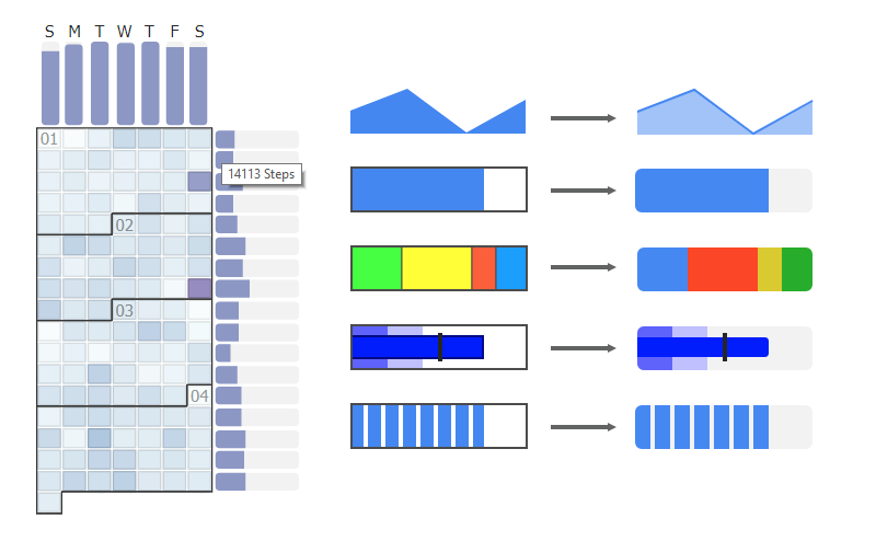
Microcharts have been enhanced with a clean and modern look.. Additionally, a rotate option has been introduced which is useful for custom fit and rotation requirements as well as rendering microcharts stacked horizontally or vertically across axis ticks.
Other
- Scroll panel on calendar cells labels that don't fit.
- Scale column labels to fit vertically when autoHide=false
- JSC.label() icon animations
