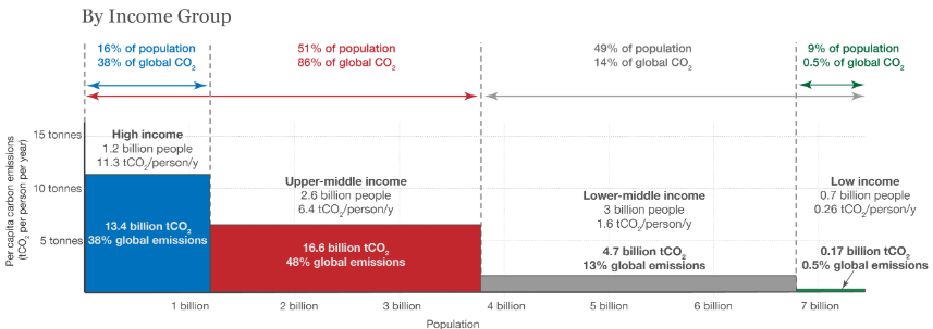
For this challenge, I emulated a powerful chart which visually communicates the inequities of carbon emissions worldwide. A small percentage of the global population is responsible for a disproportionate amount of emissions and this shows how large that disparity is. From the original bitmap source chart, I created a vector based (SVG) chart using a JavaScript chart library. The original chart was dominated by text which made it less accessible and includes multiple axis that less technical viewers may be confused by. By integrating icons, simplifying labels, utilizing a category axis on x rather than a numeric scale and removing extraneous data, I hope the new chart communicates this important data to a less technical audience.
Original