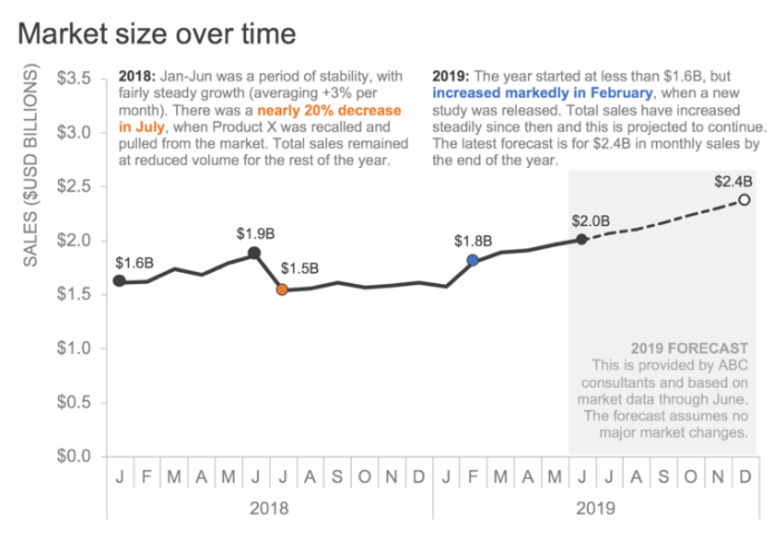
This month we were challenged to re-brand an existing chart and selected Subway who underwent their own identity rebranding in the past few years. The new brand introduced a new color scheme which was drawn upon and the distinctive arrows, which were continued over in the new design, were also leveraged. Research was conducted online and, since the new rebrand was extensively studied at the time, there was a lot of discussion to draw from. As the original chart shows a sales forecast, the arrow from the logo type was also incorporated into the chart to clarify that was a forecast into the future. A JavaScript charting library was used with range ticks to emulate the axis styling of the original chart with arrowed ranges to fit better with the more organic lines incorporated in the design of the Subway brand. Using a live chart enables the major points and transitions to be labeled on the chart while dynamic tooltips reveal the exact values of less significant data points on hover or tap on mobile. A heavier font was also used for axis to better fit the weight of the brand logo. The result can be seen below.