Waffle Charts
JavaScript Chart Types
Waffle Charts
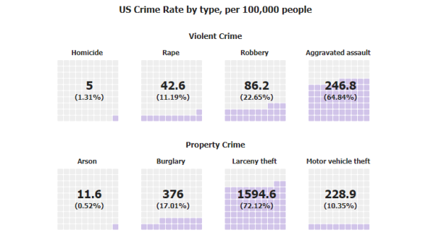
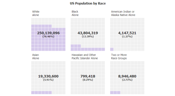
Waffle charts visualize completion percentage using a grid of colored cells or tiles. Functionally similar to a linear gauge, using a grid allows for glanceable comparisons. The more cells that are filled with color, the closer to your goal or 100% target. While gauges or pies can be difficult to quickly evaluate due to different axis scales and angled slices, Waffle charts allow for quick comparisons by glancing at equal areas for a given category.